How did you attract/address your audience?Although the price of my magazine is at £3.00 (could be considered quite expensive when attracting an audience partly consisting in the E category demographically) with the magazine being produced monthly, I feel this price is reasonable for my audience and it also ensures reasonable printing quality.
Due to my audience being integrated according to the psycho graphics (influenced by others around them as well as being confident individually) by displaying my main cover artist in a thick woolly jumper as well as a green checked shirt on my double page spread it effectively represents the alternative genre (may be viewed as an alternative way of dressing)– addressing my audience as they may feel the artist represents them in this way or they can aspire to the artist – catering for both of the inner and outer-directed parts of my target audience.
As well as this, the teasing contents may make the outer-directed part of my target audience feel ‘part of the scene’; involving those who enjoy the ‘Glastonbury’ festival may make them feel part of this group, influencing them to purchase the magazine.
The splash on my front cover offering ’15 best-selling rock songs’ may entice the audience as it is free information that they would before had no idea about; creating this idea that the magazine gives them information in a ‘freebie’ manner that they wouldn’t have had access to beforehand.
If a linking ‘SOX’ website was created for my audience, I imagine it would have a number of free apps that the audience would be able to get hold of, relating to the genre – apps that allow a stream of music from certain bands or apps that give specific festival/gig information for example. As well as this, the website would contain information that links with the magazine – extra interviews from artists, a chance to contact the institution and ask questions themselves etc. Again, this provides the audience with free information to further entice them to the products.
Audience feedback is shown below.
FRONT COVER.


What have you learnt about technologies from the process of constructing this product?
I used an OLYMPUS SP-600UZ, 12 mega pixel camera to take all of my images for my products and used Photoshop CS5 to edit them. I also used Windows Publisher to format the main body of my article for my double page spread.
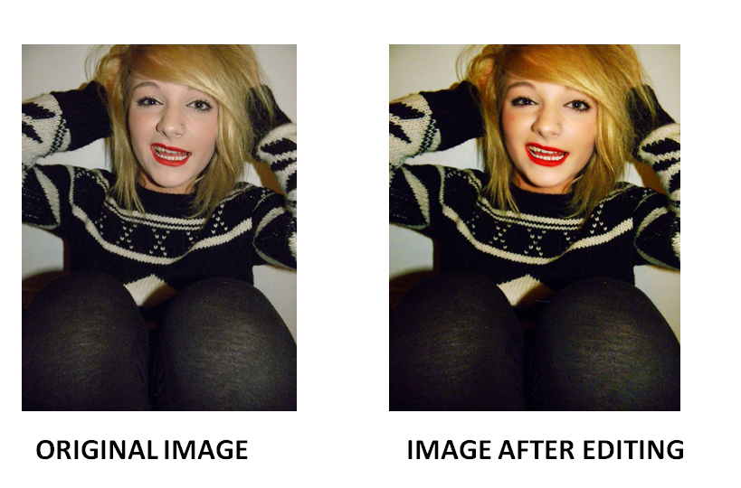
To create this image for my front cover I first used the spot removal tool to remove all of my model’s blemishes, made a copy of this layer and called it ‘skin’. I used the quick selection tool to highlight all of the skin and then located select-inverse to remove all of the background so only the skin was visible on the layer.
I then made two copies of this – just her skin. On the first copy I used the Gaussian blur tool on 10 pixels to blur the skin and darkened this copy using blending options. I then lightened the second copy using the same tool and turned the background back on. Using the eraser tool I was able to carefully erase the lips, teeth and eyes of my model – this way they appeared in focus while the rest of her skin remained blurred. With the two layers of her skin active, I selected the adjustments-levels tool and altered the levels until her skin owned a soft, appropriate glow. After merging all of the layers together, I used the overlay tool to add the glow.
I then whitened the model’s teeth by selecting the colour white on the paint brush tool, painting carefully over the model’s teeth and adjusting the opacity of the colour to suit the image.

I used the same process for my contents page main image to create the same effect – making the model’s skin appear flawless and professional. As well as this I used the quick-selection tool to select most of the background and remove it from the image – to later cover it in black using the paintbrush tool for my contents page background.

For the double page spread image, I used the same process to make her skin appear flawless but also used the stamp tool to copy parts of the red shape and cover the rest of the shape that appeared cracked. After this I used quick selection tool to select the entire red-painted shape on her face and then the Gaussian blur tool to blur the shape and make it appear smooth.
I used the tracking tool within the character tool to make the letters of my text appear closer together and used the shape tool to act as a background for my headings on my contents page as well as the splash on my cover. I used the transform scale effect on all of my text and images to position them effectively on all of my pages as well as altering the appearance of the images using vibrancy levels, brightness levels and saturation levels to make the images appear brighter, crisper and more noticeable.
I used the tracking tool within the character tool to make the letters of my text appear closer together and used the shape tool to act as a background for my headings on my contents page as well as the splash on my cover. I used the transform scale effect on all of my text and images to position them effectively on all of my pages as well as altering the appearance of the images using vibrancy levels, brightness levels and saturation levels to make the images appear brighter, crisper and more noticeable.
Looking back at your preliminary task, what do you feel you have learnt in the progression from it to the full product?

In the progression, I feel I have become much more familiar with the tools on Photoshop and how to use them successfully. I have much more confidence using the quick selection tool – making my images look more clean-cut and professionally cut out of their original background and I have learnt the process in which to correct the models skin – making it appear much more flawless and professional (previously, I had great technically difficult with the Photoshop programme and was much slower in the editing process). I am more familiar with the digital OLYMPUS cameras and how lighting can have a particular effect on the image – making my images a greater quality. I am much more familiar with the conventions of a magazine; in the preliminary task a bar code was not evident, the date of the issue was in the left hand corner instead of a conventional masthead, a teasing contents, splash or puff was not evident along with clear main cover lines, the numbers for the pages were not clear and the content was not conventionally listed down the left-hand side of the page. I followed the majority of magazine conventions on my music magazine products to ensure an effective, professional look.
With time management, I feel I prioritised my time much more effectively when creating my magazine products – I felt I was much more knowledgeable about exactly what I wanted to create and spent a lot more time ensuring I achieved the look I wanted to. With this, I was able to re shoot my front cover images – I originally took them with a lot of time to spare, so when they didn’t result as effectively as I’d hoped, I could re-shoot the images with plenty of time for the editing process. This ensured I achieved the ‘look’ I wanted to achieve.
As well as this, by collecting audience feedback on my first draft contents and front pages of my music magazine products, I was able to decipher which parts were of better quality and more appealing to the target audience than others – by hearing from the audience directly it helped me to understand what they would prefer to see on my products and which style they enjoyed the most. Furthermore, this helped me improve my products and make them of a much higher standard.
Although the images in the preliminary task appear to contain glasses and the correct clothing to link with the ‘geek’ theme, I don’t feel like the images link as well with the products as effectively as the music magazine images do – the dominating, close-up front cover image seems to directly address the audience much more effectively as well as the use of costume representing and addressing the alternative genre audience. From this, I have learnt how to link my model’s facial expression and clothing with the storyline behind the image as well as the attitude expected from my audience.
No comments:
Post a Comment